Porvoo Triennial is an overall art exhibition where art will take over the city space with the theme 'Color is a Common Thing'. The artwork of the exhibition is on display in the public city space and in traditional art halls and museums in the center of Porvoo. On the other hand, the exhibition expands towards suburbs and areas where art is not used to be found.
We want to bring you alternatives to use color to shape opportunities, ideas and examples in our society, our city, our village, our suburbs and our backyard and our traditional art spaces. Color is part of art and everyday life. The theme Color is a Common Thing can be understood as an acceptance of difference.
We want to bring you alternatives to use color to shape opportunities, ideas and examples in our society, our city, our village, our suburbs and our backyard and our traditional art spaces. Color is part of art and everyday life. The theme Color is a Common Thing can be understood as an acceptance of difference.
Porvoo TriennialPorvoo Triennial is an art exhibition held every three years. The event is artistically thematic, organically growing and based on networking, partnerships and community spirit. The centerpiece of the event is an art exhibition located around the city, bringing together a large number of renowned Finnish and Nordic visual artists.
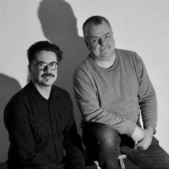
The Triennial comments on Porvoo's various temporal and functional areas, infiltrates the city and encounters and challenges people in everyday and unexpected situations. In 2021, art will take over the city space with the theme Color is a Common Thing. Petri Hytönen and Stig Baumgartner |
|
Exhibitions
”Discussing Color”
An interview with the Curators Petri Hytönen and Stig Baumgartner
Why was this special theme chosen?
SB & PH: This is an obvious continuation to the first triennial. A clear way forward. Let's take ”Drawing” first, then ”Color” and then maybe ”Space”, etc. Simple subjects which artists approach with their own simple or complex ways. Color is an easily approachable, common factor here, and does not exclude anyone.
SB: Color can be approached scientifically or completely subjectively - and in art in a number of different combinations. For example, the extremities of light, black and white can be thought of and measured as light and not light, so black is the absence of light and color, negation. Symbolically, black and white are opposites, opposites like good and evil, empty and full, etc. and thus complement each other - and are already the keys for thinking.
Color exists in light. Color has no other form but to be present as itself. To simplify, every color is always a color, and because it has this immediate and direct presence, we try to understand it, for example, by giving it a name. But how to give a name that does not already capture its essence. Film director Aki Kaurismäki had a beautiful example of color naming. He instructed his stage director to paint the walls of the room in the color of olives dug from the ground. That's how it often goes: choosing a color is already a story in itself, and as a viewer, you enter that story by simply allowing the color to be what it is.
On which grounds did you invite these artists?
SB: The artists have been chosen specifically for the theme, with different mediums, traditional painting, sculpture, video art, performance.
PH: The use of color is not self-evident to sculptors. The selected ones have color involved at some point in the artistic working process - or, like Aurora Reinhard, colorlessness - plaster and white including a small colored twist. Markku Pääkkönen has a long career in color, with regard to several public works, Leinelä in Vantaa as his last public artwork. Mikko Paakkola is a "skyline painter" working from a rather monochromatic tradition, whose work is mainly about pigment. The color itself is for him a very particular physical element.
PH: Co-workers Kalle Turakka Purhonen and Sampsa Indrén are working to achieve Finland's thickest flagpole and there color is humor and symbol for a soft sense of nationality.
SB: The color can be material or symbolic, such as the juxtaposition of blue and white, or like the rainbow colors of Timo Tähkänen, or Maimu Brushwood. Maimu is the alter ego of the visual artist Timo Tähkänen and a drag artist. He is an artist who makes paintings and installations, for which color has an important content. In the past, he has combined artwork and working in hospitals.
PH: Kirsi Mikkola's large color collages are pure color. She is unique in her significant color collages. And the color is all-encompassing. Of course included with great compositions. She lived mainly in Berlin for decades, even before the wall broke.
SB: One can think of the fact that there are many artists. There are many good ones who could be involved, but when you choose one, it can also lead to another: when you think of Kirsi Mikkola's collages and then compare them to Maija Närhinen, who also makes collages, but her work is more spatial, three-dimensional.
PH: Maija Närhinen uses also the aspect of recycling.
SB: We have chosen artist pairs or groups of three. There is an interaction between different groups, some new perspectives.
PH: Among the artists who enter the Runeberg house museum are Anne Meskanen-Barman, a sculptor who has always been using a lot color in her sculptures and it seems to come very naturally. Aura Hakuri and Linda Granfors are both painters by education and color is not always with in their performances, but when they do use it, it comes with a lot of power.
SB: They also emphasize that the background of a painter can be seen in their work, even if it is a performance.
PH: Heikki Marila, who has been ”Monet-minded” in his last show, will show very expressive and physically involved painting.
SB: The works of Pekka Sassi are quite minimal video, although at the same time quite comprehensive and require sensory tuning. His video installations have slow color transitions.
PH: There may also be photo printouts. Digital display-based color works matter a lot. It appears in the additive color world, but not in this subtractive. That's the big difference. Though not many videos are selected.
PH: The artist for whom color has always been important is Reijo Viljanen. His paintings are shown in a semi-retrospective way. Jukka Vikberg's ”equestrian statues” will also be in the same gallery Kappalaisentalo. These two artists are experienced with long careers and they make a nice comparison in the expo.
SB: Think of this theme as "Color is a common thing" and how it relates to people's everyday lives, for example, when someone puts on clothes, one is already thinking about how color or the person itself comes out. Are the clothes too colorful or do they have to be colorful? Such choices, whether one wants to stand out or not, are already appearing through colors in a normal world. Even in art, color is always a choice for a painter, for example.
Among the artists are there some who challenge the traditional symbolic meanings of color?
PH: Timo Vaittinen has earlier made colorful epoxy paintings, now he is thinking about the color of damnation, hell and the devil.
SB: Artists usually don't want to lock in colors and their meanings, but when looking at it over the long term, the artist often repeats a certain color scale, a recognizable palette. There are reasons to return to some colors.
PH: Through the juxtaposition of color, Timo Tähkänen creates different energies with colors. The works seem terribly healing. The message from the works is that color matters and affects the energies of space. For others, the energy is not equally accumulative. This may be a stigma to talk about, but in reality this is clear color psychology.
SB: On the other hand, in Marika Mäkelä's paintings, the ornamentation of color and energy are strengths, although the word ornamentation is easily avoided. Heikki Marila has painted references to art history, both in his abstractions and in his clearly figurative works. In his work, for example, red is associated with blood and through it, for example, suffering, but when they refer to art history, they may also contain irony. It also depends on the context in which the work is displayed. If you compare, though, that work is hung in a church or a shopping mall. How locked those meanings tend to be is interesting.
PH: The space, time and location are the basic and crucial elements for our species.
SB: Tiina Pyykkinen has done a lot of black work, albeit colorful, not absolute black - it is also a statement to exclude colors.
PH: She brings out how close black there are also colors, and she has pretty much brought the idea through purple. She also uses reflections and their images, as well as the importance of glossiness and matt in different layers. In a way, her work is semi-additive because the reflection is reflected differently from the work. The color tones change quite like in kinetic art, according to the viewer. It's semi-additive.
About color theories and teaching
PH: Stig and I have been holding a color and composition lab at the Academy of Fine Arts for several years, initially a color lab. However, through composition, the subject matter expanded quite a bit. We got Finnish, sometimes foreign, artists and theoreticians to lecture. Through this, the perspective broadens quite a bit as if one were to think only of the basic subtractive color theory. It's one world, but then there's also the world of light, the additive color world created by electricity and magnetism. And we live hand in hand using both subtractive and additive color worlds. Through this we get very different perspectives. There are a couple of hundred different color doctrines, but the last fifty years the most used are the color theories by Goethe, Itten and Albers. A Finnish artist Martti Kukkonen used to teach with only the CMYK printing colors subtractive painting. It means only using 3 shades (cyan, magenta and yellow) + black and white. With that no one can go very far, as a painter understands. But by mixing and using color as physical material and matter we come to the physical nature of the color, what the pigment is, the mineral, the organic nature of the color, the vegetable color, the synthetic color, etc. In a more conceptual world of contemporary art meanings are sought and through this additive and subtractive color find it´s self-evident place.
SB: We both have a painter's education, and Petri was just talking about the physical use of color. The color theories developed by the artists, relating to perceptions and how colors are seen and used, for example in painting, have not undergone tremendous changes. Of course, the psychology of color perception is evolving. Goethe's color theory was only now translated into Finnish, a couple of hundred years after its publication. Although the book is outdated in many ways, theory is still very interesting and has influenced art a lot. Goethe has also influenced later artists' color theories. There is already color education in primary school, at least the primary colors are learned.
PH: However, I feel that the color education is taken quite a bit for granted. For example the seven color contrasts of Johannes Itten and the practise seems somehow underestimated. People have very different abilities to use color, and on the other hand, sometimes some pretty interesting stuff comes out of this ignorance. I think that the general level of color education is weak. It doesn't help much if you know that mixing red and green you get brown and grey hues. Goethe is the only one of these three theoreticians who talks more about the additive nature of color in this universe. Of these flash effects, after-effects, and the resulting simultaneous effects…
SB: Those are art school stuff, a bit like studying music theory and notes. At some point, they come up. Some people are interested in them more and some less.
SB: There are social phenomena where people discuss whether a color is brown or green and opinions are divided. People are interested in color - it's related to everyone's own perception. As an artist - and painter myself - when I also paint while traveling, I pay attention to what other travel companions might not do - for example, what is the color of light in every place . As an artist, I will pick up those observations and it is richness, of course.
PH: It's also pretty much the fact that people don't even see it when they don't study it. Amateurs will have the most intense experiences if this color seeing can be passed on to them. For example, many do not see how different the colors of light are inside and outside. Many painters can also be color blind - at least in part… Although we humans see colors pretty much the same way, some see them differently. There is some level red- green color blindness among men about 8 % and among women only 0,4 %. But generally nature has shaped us quite equal hunter's instincts and ability to separate colors for berry picking!
SB: Color is always a statement, an opinion. You will notice this, for example, in the architecture debate. If the surface of a house is made of stone or metal, it will not cause such reactions, but if it is painted in any color, it will immediately attract comments. The question always arises as to why it is this color, there is always a reaction. I've done public art works. In conversations, black or white does not arouse the reaction that a color causes. You always want a justification for the color, or an explanation of why it was chosen. The old empire houses in Helsinki are light yellow, pink or blue and accepted, but when colors come in new buildings, they always arouse someone's opinion.
PH: A good example is also the houses in Venice compared to the houses in Burano which are colored in brighter colors. Hundreds of thousands of tourists go there every year to see those colors. In Venice, the colors are more subdued.
There are reactive colors and more passive ones that are broken by their own bright nature and are accepted in quite different ways. Therefore, art with a slightly more subdued color scheme is much more acceptable on middle-class walls than those bright works that, when reactive, also provoke irritation. Like the eye-catching colors in traffic.
SB: There are also statistics on what color works best for sale. Black and red are popular in cars, as are metallic colors. Color is a common thing, it is present in quite a few everyday things and in life.
A color of the year is decided every year by a special committee. Does it happen to be in any way relevant for artists?
SB: Fashion colors appear in art. In the same way, artists are exposed to color as anyone. It's not that extraordinary and things go the other way too. Perhaps one could imagine that movies have been such a trendsetter or some other cultural area than just Fine Arts.
SB: And for painters, the use of color can sometimes become problematic when you've learned too much and can't use or choose any color anymore. Sometimes the solution is that the artist buys these "fashion colors of the year" of the paint shop. I know of cases where the artist has used only them. That choice becomes part of the work and then of course is then mentioned as part of the work.
PH: On the other hand, "fashion art" can go so far that you can no longer make your own canvases ... Color is also interesting in the sense what sort of signals we give in territorial and class society thinking. In Finland it may be appear in how little color you are using… Stripping off the color, ending up just wearing grays. Or like dressing into black in the 80's, 90's and early 2000's, was still an obligatory outfit for the roadies. Maybe you want to go a little with the landscape, and as we go towards summer, the color comes more into the dress. Maybe more conscious use of colors. Consciousness and the subconscious divides also us artists how we use colors. For example, I take colors according to instinct, and when I was younger I did so much more. This is a total contrast to the use of fashion colors, which uses that superconscious lip gloss set.
The geography of color
SB: After all, Finland is a gray country and often without a shadow. The light here is wonderful in its own way. On the other hand, if you think of countries with strong light coming directly from above, then there are strong shadows.
PH: And, of course, wonderful blue shadows!
SB: The Finns have researched that gray and also found great things about it. But nowadays people no longer work so much on perceptions. The themes are taken from the phone screen and there is a whole different color scheme. And it has unified it. There are no longer so many cultural differences.
PH: Yes, there is a point when, for example, I was in China and there on the mountain I was admiring the great colors of iron oxides and directly silting and using them straight in my monotypes. The connection to that soil was strong. In Finland we have much more a gray-brown clay earth color, and then there are some shades of sand that sometimes become slightly yellow and red like granite. And then, our great and very different seasons from the Nordic darkness to the midnight sun and everything in between… It's so intense! However, we are physical beings and we are related to our environment. For example, here in the studio, I wonder why I have different lights mixed up and it even starts to annoy me. Yes, I wonder if I could just use daylight, like Tor Arne. And starting to think the meaning of natural day light.
PH: And often we are thinking a little about what the pigment really is. Many people are shocked to hear that if you take cadmium pigment in your hand and leave it on for three days, you can already get skin cancer… Sometimes the basics are taken for granted.
PH: Color is strongly related to our environment, our planet, ecology and through it to our subconscious. Biologically, as a warning color, as a mating ritual color, as a means of hiding and as a color separation ability for berry pickers, for example. This physical nature of color is partly self-evident to us and is also strongly linked to many symbolic and primitive - partly animalistic activities. For myself, this has emerged from the need to paint in the woods and outdoors in nature - as part of nature. Through this we also get the feeling that we are part of nature - and through that, for example, nature conservation, the wider worldview - and possibly also empathy and ethics - which are also related to color, but that's a longer story...
What kind of personal unforgettable experiences have you had with color?
SB: Many of my experiences are related to my own art, for example, when painting outdoors. Whenever you make and paint an observation, it is a significant experience and it is difficult to value them individually. I really like these gray days, especially in color and light.
PH: In the mountain fires the light and shadow have become unreal... Smoke turns sunlight bright red and shadows completely green. Smugglers and their matches… When you see it on a street where you otherwise would see a yellow light and a purple shadow. But you see a red light and a green shadow. The color experience is pretty intense!
Light and studios
SB: The eye seeks balance in the light. Bright light eats everything else. Daylight varies, its color or shade changes throughout the day. Sometimes it is bluer and sometimes redder. Neutral daylight is by no means an absolute thing.
PH: The finest studio light for portrait painting had Anders Zorn in an old shed in Mora with a square quadrate-shaped and sized skylight window towards the north. Otherwise, it's a totally dark and black shed. In its center light is a majestic and powerful element. I have not experienced anything like this in no other studio. That's where the experience of the northern light really worked - though it doesn't mean so much to everyone.
PH: Rafael Wardi once explained how he painted the interior and exterior colors in his big painting. In the attic he painted the colors of the attic and then carried the painting outdoors to paint the colors outdoors. It is a beautiful and simple description of two different color worlds in the eyes of a painter. Pragmatic description of a simple yet so difficult way to understand and experience color. Of course other people are more educated to see, understand and use color. Sometimes I break up harmony and create disharmony. And when painting a flat gray, it is important that the light in the workspace is even.
SB: People use the terms cold and warm colors in their everyday speech, and that's the terminology that has come from art. It is invented, this classification, that some colors are cold and others warm. Thus, it is given a symbolic meaning. This is to describe the nature of the colors or their psychological effect. You can say that the color is like blood red or you compare it to some weather condition. But in any case, one of the basic attributes of color is that people want to articulate them or to articulate their experience of them.
PH: That's the warm-cold idea. It is difficult for others to understand why something is kept cooler, for example. Blue has had this problem. Somehow related to the idea of distance. Sometimes it causes problems for students. Color temperature is a characteristic of color. The color temperature, between cyan and ultramarine blue has been difficult. What is cold or warm? Experience is also subjective. Color is also an expression element. What is the mood of color?
SB: For example, when we talk about Vincent van Gogh, we always talk about his temperament. One might as well think that his colors were symbolic. It is too easy to interpret that a painting would always reflect the painter's mental state.
Co-operating with architects
PH: The bohemian artist is disappearing. There is no place for a degenerated artist anymore in the society. The world is getting harder. It is not only a matter of degeneration, but of the meaning of describing and experiencing emotion. The media often gives space for the big, the great and the rich. Pääkkönen at Leinelä in Vantaa is an exception.
SB: Artists, too, are often too cautious. Many public works are almost invisible. I remember when I did a big, colorful painting on the stairwell, the architect said that this is at least visible. On the other hand, for some artists, visuality is not the only approach.
SB: Graphic concrete used in public buildings is colorless by default. It's very popular nowadays.
SB: In the wow architecture debate, I wonder about the attitude that something like this should not be done. Why not? After all, there must be something in the capital that distinguishes it from other cities. If the target is significant, then of course it can be wow. At one time, Kiasma in Helsinki was too much for many, as was Temppeliaukio Church, which we are now proud of - and the church is still wow! Here too, the mentality is such that one should not become too visible.
Wow architecture in colors?
PH: No such colored wow architecture has been made yet. A collaborative project was carried out with architecture and art students in connection with the Guggenheim museum plans in Helsinki. That place would be great for wow architecture all the way from old market hall to the Silja Terminal. There's space. Just a few towers are being built near Redi mall at Kalasatama in Helsinki. A couple of those "basic blocks" upright. Is that our wow architecture? In Denmark, we went with students to see the Bjarke Ingels Architectural Office designing "8 House" and that was a good example of wow architecture! But even there the color was nearly just in the color of the elements… The wow architecture really awoke me. Could one think that architecture would be started by color? As a starting point. It could be a challenge for all architects that we want to implement architecture through color.
SB: One local nice color thing is Helsinki's bright orange metro. It works and you remember it. After all, the use of color in architecture has increased.
A common thing
SB: Color is a common issue, it is an important theme. The practice of the artist's work has been discussed quite a lot here. According to our theme, color is no stranger.
PH: Color also has the importance of acceptance, it plays a big role. For example, pride and sexual equality, acceptance of difference at all.
SB: Maimu’s Color TV refers to community and its strengthening. After all, art is a way to get people together. I have the idea that our audiences can learn to like very different works. Personally, I am not against any art direction. And I've learned to like various forms of art and artists. For example, Gerhard Richter, at first, was such that I could not understand his use of colors until I realized that he was not seeking harmony, beauty or order in his paintings. In general, all foreign cultures, such as traditional Indian painting, at first feel like you can't get there, but when you get to know it enough and don't project your own preferences for it, the situation changes.
The relationship between art and society
PH: That's a strange idea if everyone was striving for harmony. It is a big deal to learn all kinds of things while studying art, but we as an audience can also learn to accept pluralism. We learn to accept different expressions and different people because the works are already crystallized from the works of a certain type of persons or groups of artists, so accepting that plurality is already a long way in the development of a wider acceptance of what someone does, thinks and says. It is frightening to see around simple black and white thinking, populism and the rise of extreme right wing. At Galleria Rankka we have now an exhibition of degenerate art, so we are thinking about provocation and power. The social aspect of art is essentially rather lame.
SB: Two things often get a little confused. There is a so-called political art or activism that takes place within and in the name of art - and does not necessarily resemble traditional art at all. Then there is art that may deal with social issues. Contemporary art is such a diverse field. Already in the 1960s there was happening and activism. Political opinions were expressed through art or under the institutions of the arts.
PH: Who defines art? What we see as art is an eternally varying concept. How much dare we go into politics as artists, how many visual artists have been congressmen. We have been nearly completely lacking direct action through art.
SB: Artists can be involved in various activism movements and they act as artists in them. Nowadays, political activities take place through activism rather than by becoming members of political parties.
PH: Oranssi association has done a lot, for example, student housing as a result of the squattings. In the field of art, neutrality has prevailed. Middle gray bureaucrat. An artist may have a personal need to remain independent.
SB: After all, we have, for example, state-run museums that are still trying to show political art. State-supported art also allows us freedom of expression.
Is there something provocative on the way?
PH: What's potentially provocative in the city is represented in the comics, for example, by cartoon artists Emmi Valve and Taina Hakala. They have the ”Colorize Porvoo” idea where the public can interact with their cartoon graffitis in the city. They are among other things members of the Kutikuti-group, organisers of Å-Fest and activists of the Finnish comics society.
SB: Kiasma was once surrounded by a pink fence that was also a work of art, "Color for Marski” (Mannerheim). The color of the work became an uproar.
PH: In the Pre-Triennial, artistgroup Joymen worked with immigrants and Borgå Folkakademi. We only got positive feedback. Could it be possible to create some color space here, experiencing a good feeling for everyone, without unnecessary distractions and questioning? Color is enjoyable, even overwhelming and sometimes a bit aggressive and exhibitionistic. Color can be a common good. It is often the case that artists themselves reduce the wow effect in their works. You can have your own locks and talk about them. It takes courage.
SB: When the Italian representatives of the transavanguardia came in the 1980s, they made giant-sized expressive paintings. If you see them in Italy, they won't look that big anymore. Italians are used to big paintings, and the courage to do it may not have been such a big deal anymore.
PH: Ceiling paintings of the Renaissance period are pretty crazy. And what happens with the facade painting. Bauhaus, modernism and minimalism plus predatory capitalism have been somehow narrowing the perspective and possibilities of using color in a wider scale. In the cartoon, Tarmo Koivisto's Mämmilä features a picture of postmodern Finland. It did not develop properly here when it was quickly replaced by nihilistic minimalism, steel and iron. It seemed to be a short period. And then came the wow architecture.
Light and color
SB: It's quite dark in Finland, people are a lot inside. On the other hand, it is a pity that there are those new bright LED lights everywhere and that twilight is rare. We are no longer used to the twilight.
PH: The limits of visual perception, what are they? What about the color temperature. Our senses are very mild. Astronomer Esko Valtaoja once said well at some opening ceremonies, "It's strange now if we are the crowns of creation!" Where are the limits of our senses? Can we use science to awaken people to see colors even better?
SB: Our color perception ends in purple. Some birds still have colors that we don't see. It's a funny idea that there are colors that we don't have a gray idea of what they look like. We only have certain wavelengths in use in our observations and we think the colors are in it - and it isn't.
PH: It is interesting to think about the potential for human development of sensory enhancement. Probably there is still time in future for this.
SB: Color theories vary in what primary colors are. At school we learned: red, blue, yellow. It is an agreement that this is so. The television has different main colors, additive colors: red, blue and green. The printers come with CMYK subtractive colors, cyan, magenta, yellow and black. On the other hand, there are also gold and silver and whatever the different pigments.
PH: And the semiotic experience of color in gold or silver. Is it perceived as more symbolic than physical?
SB: Older art has a different color theory than the way we think today - the idea of a local color. For example, blue clothing with light and shadow points made in dark or white. Then they started to think that light and shadow have some color and that light also affects the local color.
PH: Tizian already had great colors shadows and half shadows. Oil color painting modifies the process. Old paintings had a long waiting time between the layers. Vermeer as a great layer painter always comes up sometimes. The use of color has been symbolic, for example in liturgical colors.
SB: In Mark Rothko's technique, layering is equally present.
PH: The therapeutic ratio of color and it´s understanding is increasing today. It has a large growing crowd of supporters and they think that color effects strongly on the state of mind. I want to keep my studio pretty neutral in color. I have to go south in the winter to work to get a stronger yellow light than here. Here we have this gray and cold yellow light.
SB: Color from theories. For example, Steiner pedagogy has its own color map. There is the color of pure love, etc. Then there is the non-symbolic relative color theory developed by the artist Josef Albers in the 1950s and '60s. It is based on the interaction of colors and the relationships between colors. The Free Art School brought Albers' ideas to Finland, and on that basis many schools continue to teach.
PH: This is partly a Bauhaus color theory, further developed in the United States, even though Albers was already teaching in Bauhaus. For example, in the composition tasks, the Bauhausian geometry can be seen.
PH: Now we have been talking about Western cultural tradition, but there is much more to the world. Aboriginal art has a chain that has been going on for over 10,000 years. Colors for rock paintings are done with a lot of time, effort, care and with precise earth colors. Still they are doing it. What will we be left behind from this time?
Interview by art curator Susanna Widjeskog from Porvoo Museum
Translations artists Petri Hytönen and Stig Baumgartner